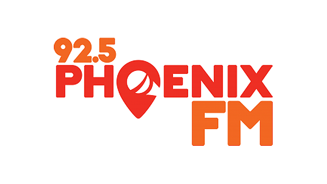
Dublin 15 community radio station 92.5 Phoenix FM has marked its 25th anniversary with new branding – including a fresh new logo.
The station say that the rebrand embraces all aspects of what they do and all their cherished listeners, and that the new logo colours of “orange and orange-red” represent the station as a positive, vibrant and all-encompassing organisation for the area of Dublin 15.
In a statement on their web site, Phoenix FM say: “The new symbol in the logo has two meanings. The first, the overall shape is that of a map pin, which for us represents the sense of community and area which 92.5 Phoenix FM is all about! The second is in the negative white space and has been designed to represent a microphone… for obvious reasons. You might also see a cheeky smile in there!”
However, they add that anyone in the community can see anything they want in the new logo (pictured above) – with some of the interpretations they’ve had already including a guitar plectrum, the M50, the Royal Canal, an ear, a French horn, a clock, a head in side-profile and, the fictional bird of their own name, a phoenix.
Phoenix FM’s rebranding process began two years ago when the station compiled a report on the case for updating the logo. That led to a logo design brief into which volunteers, board members and staff added their ideas on what the new logo should showcase about the Station.
The station worked with a number of really talented designers before settling on the award-winning Spear Design, based in Blanchardstown.

